22 marzo 2024 08:55
Syncfusion, probably the most complete Blazor component library
Disclaimer: this post was translated from Italian by automatic tools
In the world of enterprise application developers, there are two schools of thought regarding component libraries: some say they are unnecessary, that they are ‘black boxes’ you must blindly trust, and if something goes wrong, you’re in trouble. Others, like myself, consider them a necessary and ‘inevitable’ tool to save time and provide users with the best possible UI and usability experience.
I’ve previously discussed various Blazor component libraries in several posts, which I’ve used for personal side projects and real applications over the years. These include commercial libraries like DevExpress (used for the back office of mtb.rizzetto.com) and free (or formerly free) ones like Blazorise (for the Geo-Italy project), MudBlazor (for myReviews project), and Radzen (for the meteo-altoadige project).
Now it was time to test perhaps the most famous and feature-rich library, which competes with Telerik for the crown: Syncfusion, who boasts over 85 components.
Writing a review for all the components would be a monumental task, so I’ll limit myself to sharing impressions from a couple of months of usage.
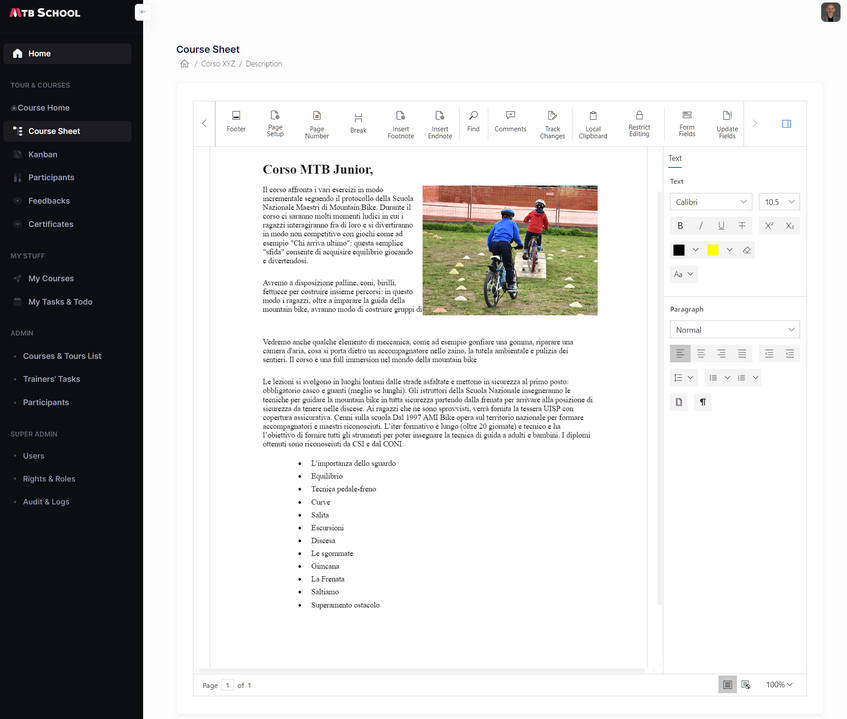
The application context was a Blazor 8 SSR+Server Side web app for managing a children’s mountain biking school. This seemed like a good example to test components beyond the usual grids or data-entry elements (such as textboxes and dropdowns).
Completeness of Components
The first thing that stands out when looking at the demos or documentation of various components is the enormous array of parameters, methods, and events they expose. While this complexity might sometimes be considered a “flaw”, it becomes essential when you need it. Here, it’s evident that the library didn’t just emerge yesterday (it dates back to 2001). The years of experience gained from previous platforms (including the glorious days of WinForms, WPF, and, to stay in the web realm, Asp.Net, MVC, and all JS-based platforms) have been migrated into the Blazor library. It’s crucial to note that Blazor is not a JS wrapper as it was in its early days; it has been entirely rewritten in C# to offer top-notch performance. Returning to the topic, each component provides numerous options for tailoring it to your specific needs. Even if a property or method you require isn’t directly available, the support team can always find a workaround to address the gap.
Gantt and Kanban
One significant advantage of this library is the inclusion of components that other competitors lack. If the application you’re working on explicitly requires one or both of these components, there’s no contest—you need to turn to the library that offers them.
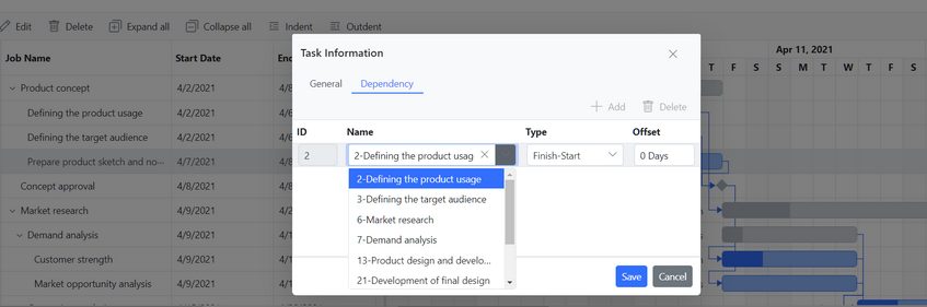
The Gantt chart visualization component is extremely complex and detailed. While I wouldn’t go so far as to call it a mini Microsoft Project, it comes close. Out of the box, it handles item editing with classic fields like name, start, end, duration (unfortunately only in days, not months or other units as Project does), and progress. Additionally, it manages all the fields related to dependency management, complete with an articulated UI for choosing predecessors and modes (FS, SS, etc.). So, while having the graphical part is a huge help, not having to create custom add/edit item dialogs is an incredible plus.
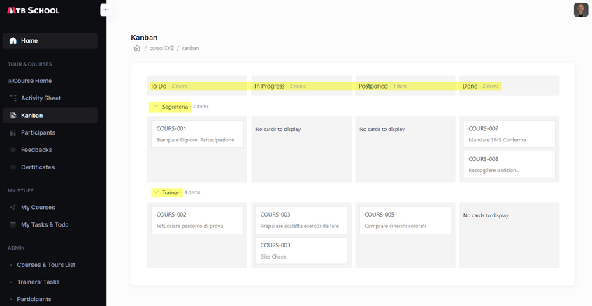
The Kanban component is a unique feature that I haven’t found in any other library. Although it’s simpler, it still provides what’s needed for straightforward “agile” work item management, such as assigning names, individuals, and statuses (which correspond to the columns where the cards are located). You can manage these items using classic drag-and-drop functionality to transition between states or assign them to different people (dragging across swimlanes).
The only drawback, which I’ve been informed they’re working on, is that the status must be a string property (“ToDo,” “Done”) rather than an ID or a reference to an external lookup table.
DataGrid
Every respectable library should have its own comprehensive Data Grid, and Syncfusion is no exception. What immediately caught my attention was the item editing within a self-constructed Dialog Form. Personally, I prefer modal pop-ups with more space and clarity over in-line editing within rows, except for very simple data grids with few columns.
Unfortunately, there are two missing properties related to individual columns (such as two boolean properties: ShowInGrid and ShowInForm). These would be very useful for displaying a field in the grid but not in the form, and vice versa. However, the support team provided two straightforward solutions. The first involves a couple of lines of CSS, and the second is as simple as setting the width of the column, you want to appear only during editing, to zero px.
 .e-gridform .e-table .e-rowcell:has(.e-disabled) {
     display: none;
 }
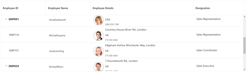
I found the Foreign Key column to be very convenient. In addition to the field that serves as the ID, you can provide a collection of values and the property to display in the dropdown. This dropdown is automatically shown in the add/edit window (but not in the filter).
Speaking of filters… I wasn’t impressed with them and found them inferior to other libraries, such as Radzen. By default, a specific component isn’t rendered for each column type (e.g., a datetime picker for dates or a checkbox for booleans). Instead, you have to create custom templates and use non-typed method calls each time (here’s an example).
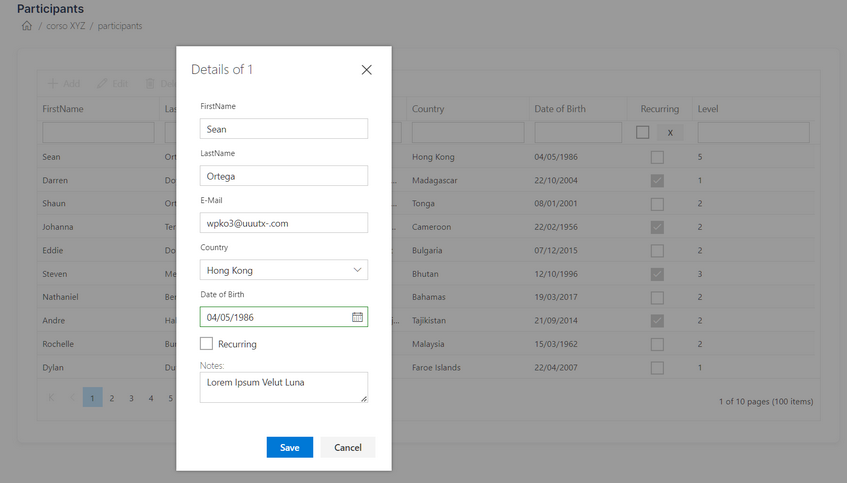
In the example above, we see a grid and its automatically generated dialog form. As you can see from the code snippet below, “Country” is a foreign key to the “Countries” table. The notes are displayed in the form but not in the grid, while the “Level” behaves vice versa.
 <GridColumns>
     <GridColumn Field="@nameof(Participant.Id)" HeaderText="Id" IsPrimaryKey="true" IsIdentity="true" Visible="false"></GridColumn>
     <GridColumn Field="@nameof(Participant.FirstName)" HeaderText="FirstName"></GridColumn>
     <GridColumn Field="@nameof(Participant.LastName)" HeaderText="LastName"></GridColumn>
     <GridColumn Field="@nameof(Participant.Email)" HeaderText="E-Mail"></GridColumn>
     <GridForeignColumn Field="@nameof(Participant.CountryId)" HeaderText="Country" TValue="Country" ForeignDataSource="Countries" ForeignKeyField="Id" ForeignKeyValue="CountryName"></GridForeignColumn>
     <GridColumn Field="@nameof(Participant.DateOfBirth)" HeaderText="Date of Birth" Format="d" Width="150px" ></GridColumn>

     <GridColumn Field="@nameof(Participant.Recurring)" HeaderText="Recurring" DisplayAsCheckBox="true" Width="100px" TextAlign="TextAlign.Center">
         <FilterTemplate>
             <SfCheckBox TChecked="bool?"  @bind-Checked="@FilterRecurringChecked"></SfCheckBox>
             <SfButton CssClass="e-small" >X</SfButton>
         </FilterTemplate>
     </GridColumn>
     <GridColumn Field="@nameof(Participant.Notes)" HeaderText="Notes" Width="0px">
         <EditTemplate>
             <label class="e-label-top" for="Project">Notes:</label>
             <SfTextBox Multiline=true Placeholder="Notes..." @bind-Value="@((context as Participant).Notes)"></SfTextBox>
         </EditTemplate>
     </GridColumn>
     <GridColumn Field="@nameof(Participant.BikeLevel)" HeaderText="Level" AllowEditing="false"></GridColumn>
 </GridColumns>
Data Form
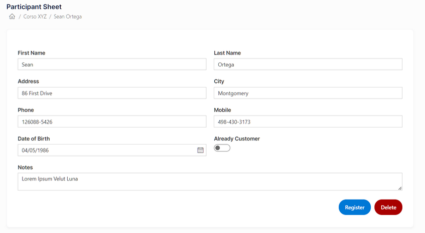
If you have many fields in a model that need editing and you want to create a dedicated page, then using the Data Form is a good choice. It’s a very convenient component for quickly creating input forms by passing a series of <FormItems> that compose the rows (or columns, as you can split the form with ColumnCount and ColumnSpan). The Data Form automatically handles validation and submission. I particularly liked the option to use FluentValidation instead of the classic DataAnnotations, which assumes having DTOs solely for input or “polluting” POCO classes (or scaffolded EF Core classes) with attributes. In the end, it’s not groundbreaking (I actually created something similar where the FormItems were just flex divs with a ChildContent), but not having to manage templates, layouts, localization, floating labels, etc., is a significant time saver.
<SfDataForm ID="MyForm" Model="@Data" ColumnCount="2" ColumnSpacing="20px">
    <FormValidator>
        <DataAnnotationsValidator></DataAnnotationsValidator>
    </FormValidator>
    <FormItems>
        <FormItem Field="@nameof(Data.FirstName)" LabelText="First Name"></FormItem>
        <FormItem Field="@nameof(Data.LastName)" LabelText="Last Name"></FormItem>
        <FormItem Field="@nameof(Data.Address)" LabelText="Address"></FormItem>
        <FormItem Field="@nameof(Data.City)" LabelText="City"></FormItem>
        <FormItem Field="@nameof(Data.Phone)" LabelText="Phone"></FormItem>
        <FormItem Field="@nameof(Data.MobilePhone)" LabelText="Mobile"></FormItem>
        <FormItem Field="@nameof(Data.DateOfBirth)" LabelText="Date of Birth" EditorType="FormEditorType.DatePicker"></FormItem>
        <FormItem Field="@nameof(Data.Recurring)" LabelText="Already Customer" EditorType="FormEditorType.Switch"></FormItem>
        <FormItem Field="@nameof(Data.Notes)" EditorType="FormEditorType.TextArea" ColumnSpan="2" LabelText="Notes"></FormItem>
    </FormItems>
    <FormButtons>
        <SfButton typeof="submit" IsPrimary="true">Register</SfButton>
        <SfButton typeof="button" CssClass="e-danger">Delete</SfButton>
    </FormButtons>
</SfDataForm>
Templates
An aspect that applies to all components is the omnipresent ability to modify the template of the item we are working on. Whether it’s the Kanban card, the calendar in the Scheduler component (which is powerful and comprehensive), or a row in a datagrid, users are always given the option to customize the graphical layout to their liking. The context of the item or row is always made available.
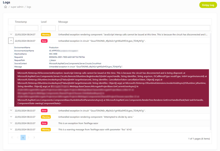
Even in the Data Grid, the freedom to template individual cells or entire rows offers extensive possibilities. As you can see below, with very little code, I created a Serilog log manager, freely "inspired" by the famous Seq.
TreeGrid and Diagram
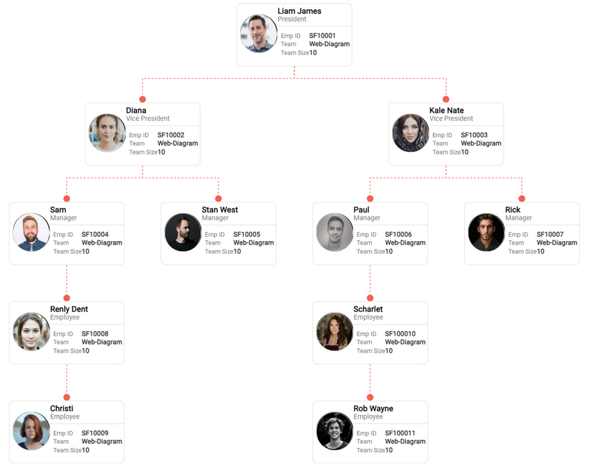
Another component I haven’t seen in other libraries is the TreeGrid, which is useful for managing items with N levels of parentship. Examples include hierarchy collections (such as organizational charts or product breakdown structures).
The TreeGrid is very convenient, but I tested it with a large collection (1000 elements), and it proved to be quite slow. This issue can be resolved using LoadChildOnDemand, but the user experience isn’t the same, and search and filters obviously don’t work as well as when loading the entire tree at once.
The same hierarchical collections can be easily visualized using another complex component that alone could be worth quite a few euros: the Diagram. For example, you can see how the sample organizational chart mentioned earlier could be displayed. If you explore the left menu of the provided link, you’ll discover how many types of diagrams, all editable and manipulable, can be created.
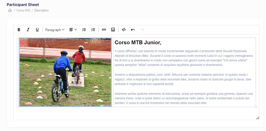
Rich Text Editor and Word Processor
In almost all the back-office applications I’ve developed throughout my career, I’ve needed a mini HTML editor. Naturally, the library comes to our aid with a simple and effective Rich Text Editor that includes all the usual features. But what if we need more than HTML? Here’s where another component makes a difference and stands out from the competition: a true Word Processor compatible with the .docx format used by MS Word. I’ve tested it with various documents, even complex ones containing images, tables, figures, etc., and it has consistently performed excellently. The only time it “failed” was when loading a formula inserted with the Equation Editor, but I’d consider that an edge case.
Word Library (DocIO)
Now, what if you wanted to create Word documents not through an editor but via code? Or generate them from a template that can be iterated with a collection to create a “mail-merge”? Enter one of the four components from the Document Processing Library (Word, Excel, PowerPoint, PDF). With these components, you can practically create any Office or PDF document programmatically. They are indeed powerful, although not always straightforward to learn. However, with the help of forums, support, and numerous examples, you can implement advanced enterprise features in your app (such as order creation, invoices, end-of-course diplomas, etc.).
Technical Support: ticket, forum, feedback portal, bug reporting
Regarding assistance from the technical staff… we’re truly at very high levels here! Initially, I was a bit bewildered by the multitude (perhaps too many?) of methods for seeking help. In fact, I even asked for help on how to ask for help 😊.
Apart from the platform for providing suggestions and reporting bugs, I assumed that tickets (presumably directed only to those who pay for the license) would be faster and more comprehensive than the forum, which is meant to be a free community tool. However, I’ve come to realize that it greatly depends on who responds. Sometimes, the person handling the ticket has been helpful, while other times, the response has been quite straightforward (“it can’t be done”). Interestingly, when I posed the same question on the forum, I received the desired solution. Additionally, on the forum, I encountered a specific feature I needed, and not only did someone resolve it for me, but they practically wrote it out for me at 90% completion using their sample. Overall, the technical staff consistently demonstrates great competence and willingness to assist, helping you out of tight spots and providing as much help as possible.
Documentation, Demo and Playground
The third element (alongside component quality and support) that I usually consider is documentation, and in this regard, we certainly have no reason to complain. There are two main branches of documentation: one focused solely on demos and examples (always accompanied by source code), and another that delves into more technical details. Interestingly, the technical documentation isn’t the usual auto-generated code documentation; it’s more conversational and includes many code snippets. Perhaps it would be better to merge these two worlds and have a single entry point for each component (e.g., the “Data Grid” homepage), allowing users to navigate to either demos or documentation. I’ve often found myself wondering whether I had read about a particular feature here or there.
The Playground, reminiscent of CodePen for JavaScript, is incredibly useful and charming. It allows you to write code snippets for quick testing. However, it can be a bit slow (well, quite slow!). Sometimes, after new service packs are released, it stops working until I clear the cache of WebAssembly DLLs. Nevertheless, it becomes an incredibly convenient tool for sharing code snippets with support (it generates a short URL that lasts for 90 days) without having to send project zips or public GitHub repositories. Additionally, it’s handy for testing older library versions or pre-testing steps for new releases, as well as experimenting with different themes.
Pricing and Licensing
Now, let’s address the “sore point” of this fantastic library: the price (which, honestly, is significantly higher than competitors, almost 4X!) and the licensing model. Unlike other libraries, there isn’t an initial purchase price followed by a maintenance fee. Instead, it starts with a subscription (monthly or yearly). If you stop paying, the application won’t function, displaying a popup that prevents further use. Essentially, it’s more like a perpetual “royalty” that I must be able to sustain, either by charging my clients or by leveraging it across multiple apps or selling a product so successfully that I can afford the expense.
However, there is a Community Free license available not only for single developers working on non-profit projects but also for small organizations (with revenue below 1 million, a maximum of 5 developers, and 10 employees) who can request its application.
Perhaps (although they have likely already made their assessments), it would be useful to have component packages tailored for specific environments (e.g., only Blazor, only desktop environments, only mobile with Maui+Flutter, etc.) to offer lower prices. However, I assume these are paths that have already been explored, and if they’ve chosen the “all-in” approach with 1800+ components and 16 libraries, they must have their reasons.
Conclusions
I was very curious to thoroughly test this library to truly understand whether the price aligns with the quality offered. The answer is definitely affirmative if we consider not only the actual product but also the level of support and documentation provided. Of course, the project where it’s used must be substantial enough to bear the costs. However, if the budget allows, I have no hesitation in recommending its purchase and use.